A polished interface can still leave people lost
The spacing is consistent. The typography looks good. Every component belongs to the same design system. Then you start using the platform, and a simple task leaves you wondering where you are, whether your changes saved, or how to get back.
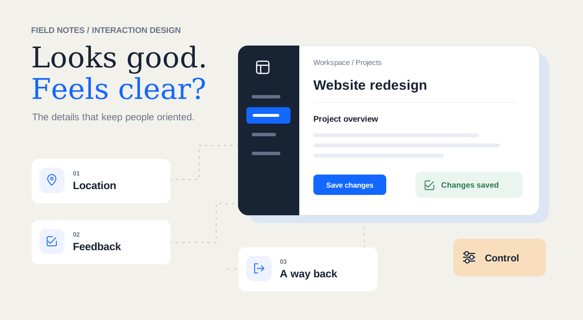
Nothing looks broken. Yet completing a task takes more attention than it should. You open a record and lose track of which project it belongs to. You save a change and get no visible response. You enter a flow and discover there is no obvious way to leave without losing your progress.
These moments are easy to miss in a design review because they become visible through use. A screenshot can show a beautiful form. It takes an interaction to discover that Cancel behaves unpredictably.
Where am I?
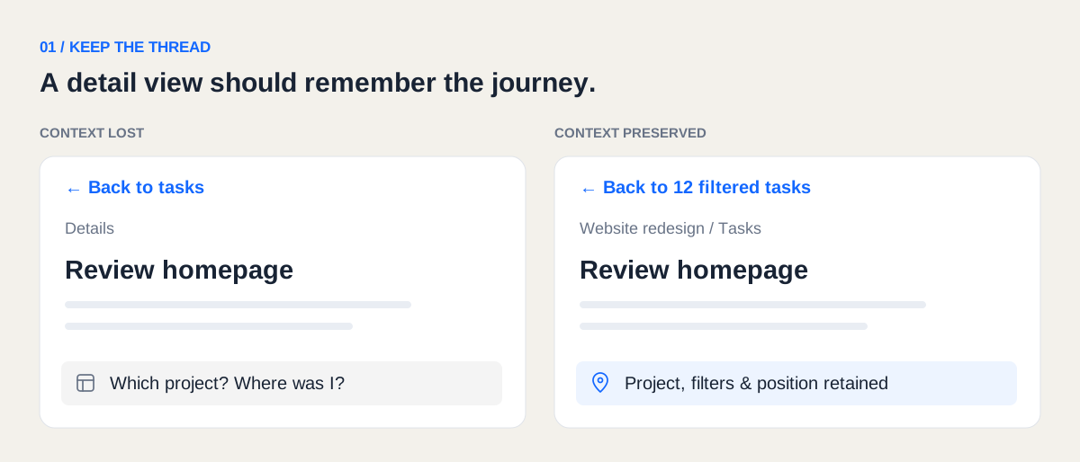
Imagine opening a task from a filtered project list. The detail page shows its title, description, and activity, but nothing identifies the project. The navigation highlights Tasks, and the page heading simply says Details. You have the content in front of you, but you have lost its context.
A project name, a meaningful page title, or a breadcrumb could establish that relationship. In a platform with multiple workspaces, showing the active workspace may be essential to understanding which data you are viewing or changing.
The return journey matters, too. If going back resets your filters and sends you to the top of a long list, you have to reconstruct where you were. Preserving that context makes moving between pages feel like continuing a task.
Did that work?
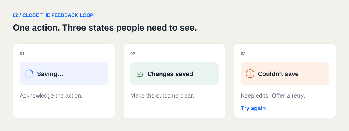
You click Save. The button looks the same. The form stays open. Should you click again, wait, or close it? A small gap in feedback has created several possible interpretations.
Useful feedback makes the state of the action clear: saving, saved, or unable to save. Its form should suit the situation. Copying a link might need only a brief acknowledgement. A failed save needs a message that remains available, preserves the input, and offers a way forward.
A toast can help, but it cannot carry every responsibility. If it disappears before someone notices it, the screen still needs to make sense. Important status should also be available to people using assistive technology.
For a long export, Export started answers the first question. People may also need to know where to find it when it finishes and whether they can safely leave the page. The feedback should support the next decision.
How do I get out?
A flow can make perfect sense to its designer because the intended path is familiar: open, complete, submit. People also open the wrong thing. They change their minds. They need information from another screen before continuing. Those paths deserve design attention.
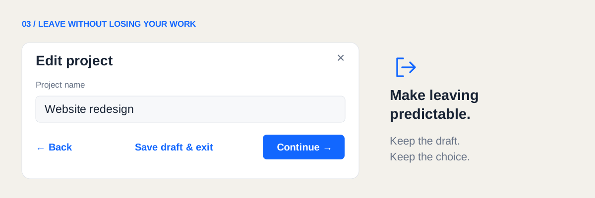
A visible exit helps, but its behavior needs to be understandable. Does Cancel discard the edits? Does closing the panel save a draft? Will going back preserve completed steps?
If the only way to find out is to try it and risk losing work, the interface asks people to experiment with something they care about. Clear exits and predictable handling of unfinished work make it easier to explore a platform with confidence.
What am I about to change?
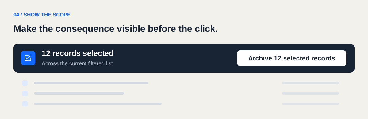
Control depends partly on understanding the scope of an action. Apply changes might affect one record, every selected row, or an entire workspace. The button can look perfectly consistent while leaving that distinction unclear.
This becomes especially important with bulk actions. If someone selects records, changes a filter, and then opens an action menu, the interface should make the current selection and its scope visible. Archive 12 selected records gives the person something concrete to evaluate.
Confirmation can be useful when consequences are serious. Reversible actions may benefit from undo. In both cases, the surrounding interface should help people understand what they are doing before they commit.
Why did this behave differently?
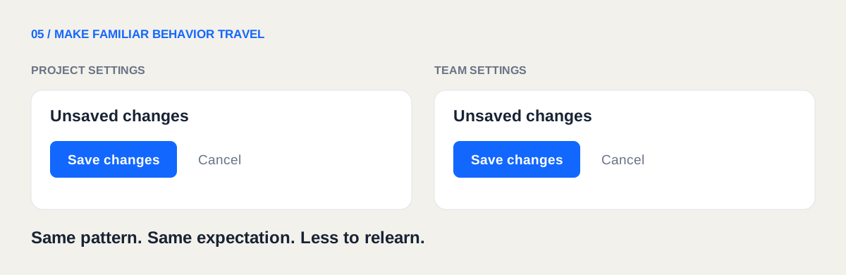
One settings page saves automatically; another requires a Save button. A row opens on click in one table, while another requires clicking its title. Closing one panel preserves edits; closing another discards them.
Each behavior might be reasonable in isolation. Together, they make the platform harder to predict. Visual consistency helps people recognize components. Consistent behavior helps them anticipate outcomes.
Where a difference is necessary, the interface needs to communicate it. Otherwise, people have to learn each screen separately.
AI prototypes need these rules in their foundation
When prototyping with AI, the setup is different. You can describe a flow, generate a working interface, and adjust it through conversation. Screens and interactions can take shape together, with decisions made along the way.
That speed makes it useful to establish usability expectations early. A generated screen may include the requested fields and actions while leaving important behavior undefined: what happens after saving, how someone exits, or which context survives navigation.
These decisions belong in the project’s core context. Asking for them separately on every screen makes consistency harder to maintain.
Describe behavior alongside visual rules
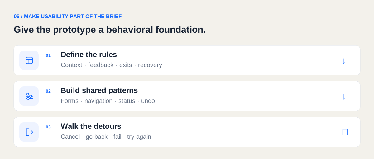
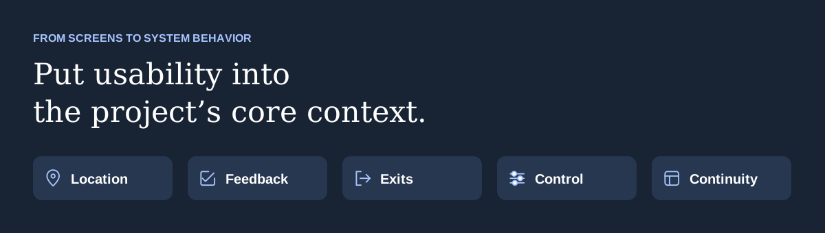
A project’s design context often defines colors, typography, spacing, and components. It should also explain how the product keeps people informed, oriented, and in control. Follow usability heuristics is a useful starting point, but concrete expectations are easier to apply and review.
- Location
- Detail views identify the current record and its parent context. Navigation shows the active section and workspace where relevant.
- Feedback
- Actions that change data communicate progress and outcome. Failed actions preserve input and provide a recovery path. Essential status does not depend on a temporary toast alone.
- Exits and control
- Dialogs and multistep flows have a visible way out, with clear behavior for unfinished changes. Actions communicate their scope and receive protection appropriate to their consequences.
- Continuity
- Returning from a detail view preserves relevant filters, sorting, and list position. People can continue their task without rebuilding its context.
- Consistency
- Similar interactions use the same saving, cancellation, and navigation behavior unless a documented reason requires a difference.
Keep a short, persistent source of truth
I would keep these rules in the project instructions or a clearly referenced interaction-guidelines file that the AI reads before making changes. The essential rules should be easy to find and concise enough to remain useful as the project grows.
That last point matters. A prototype may use local state or simulated requests. It can still demonstrate what saving, failure, cancellation, and recovery should feel like. Documenting those simulations helps reviewers understand what they are evaluating.
Give the rules a concrete example, too: Opening a record from a filtered list preserves the list state. The detail view identifies the parent project. Saving shows progress and a clear result. A failed save keeps the edits available. Returning to the list restores the previous filters and position.
As patterns settle, put shared behavior into reusable components where practical. A form layout, dialog, or feedback component can carry established defaults, reducing how often those decisions need to be made again.
Review the moments between screens
These questions connect to established usability heuristics, including visibility of system status, user control and freedom, consistency, and recognition rather than recall. They provide a useful foundation for reviewing both a production platform and an AI prototype.
Written context still needs verification. Follow one ordinary task: find a record, open it, edit it, save, and return to the list. Then take a few natural detours. Cancel halfway through, enter invalid input, navigate away with unfinished work, and try a failure state. Repeat the flow with a keyboard.
At each point, ask whether you can tell where you are, understand the system’s response, and see what your action will affect. Check whether you can leave or recover, and whether the platform preserves the context you need.
When a review reveals a recurring problem, update the shared rule or component as well as the individual screen. That turns a correction into guidance for the next iteration.
A breadcrumb, a saved filter, an inline status, or a clear exit may occupy very little space. Each can remove a moment of uncertainty. A platform starts to feel polished when that care holds up throughout the task, especially when someone pauses, makes a mistake, or takes a path the designer did not expect.